
Case Study
Syndei Embassy
Website and digital presence for a church in Accra
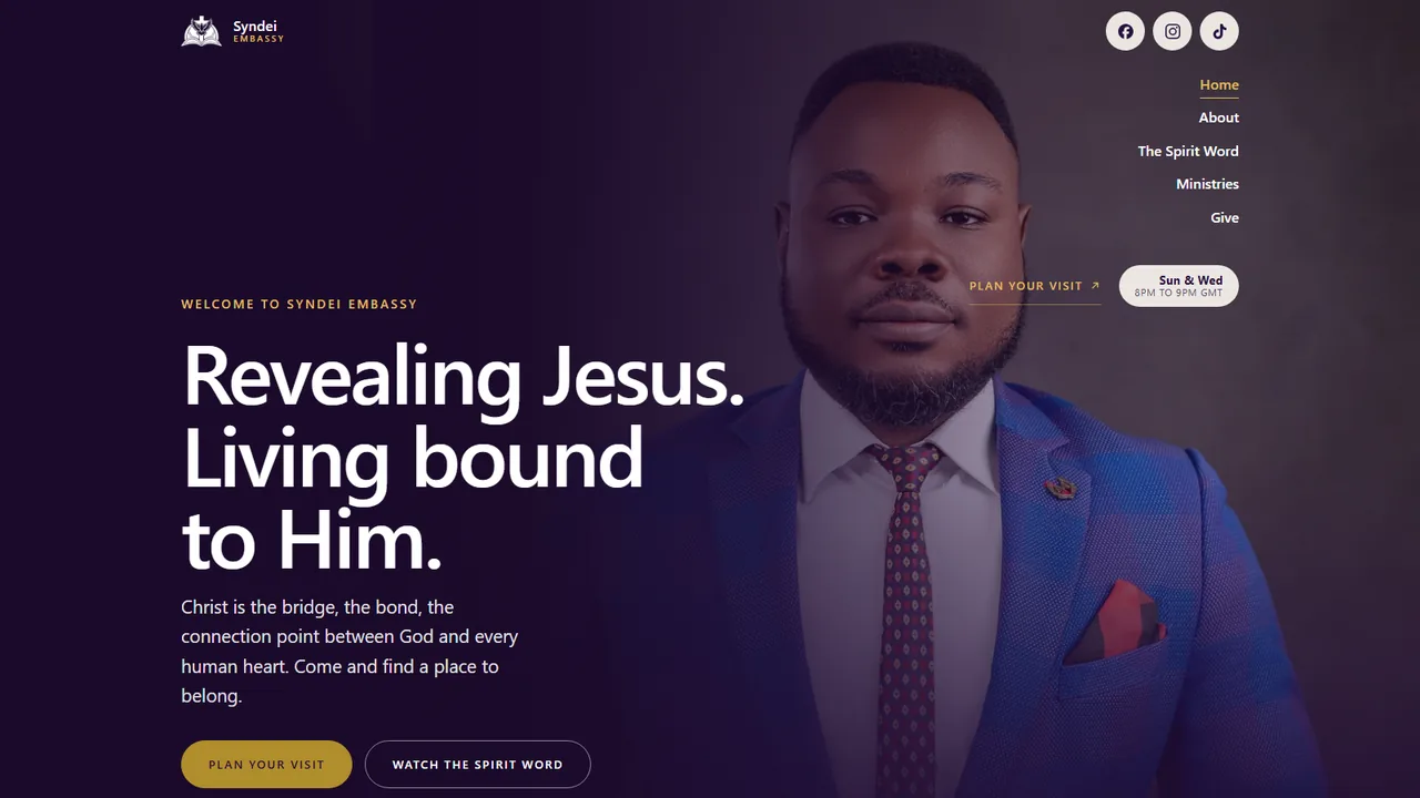
Syndei Embassy is a church in Accra. A church website is usually asked to be everything to everyone. This one was built around one question a first-time visitor actually has, which is whether they would belong there, and one action, which is planning a visit.
The brief
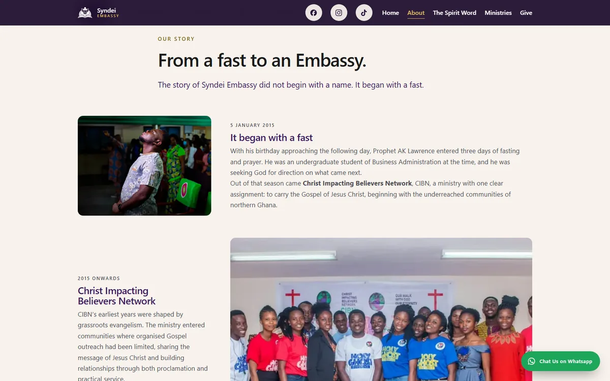
Syndei Embassy is a Christ-centred ministry in Accra, registered as a Company Limited by Guarantee under Ghanaian law. It did not begin as a church. It began in January 2015 with a three day fast, out of which came Christ Impacting Believers Network, a ministry built on grassroots evangelism in the underreached communities of northern Ghana. The church is what that teaching ministry grew into.
The name carries the argument. Syndei is Greek, συνδεί, to bind together or join. The conviction underneath everything is that Christ binds what sin separated, God to man and believer to believer. The brief asked that the site reinforce that idea in structure and language, not just state it on an about page.
They came with the writing already done. A full content package, a logo, a palette and a live teaching podcast. What they did not have was a website. The ask was the build.
The challenge
There was no site at all. A ministry with a registered legal identity, an active podcast and a daily social following at @ankulawrencek had no address of its own. Everything ran through TikTok, Instagram and Facebook, which are good at reaching people and poor at answering them.
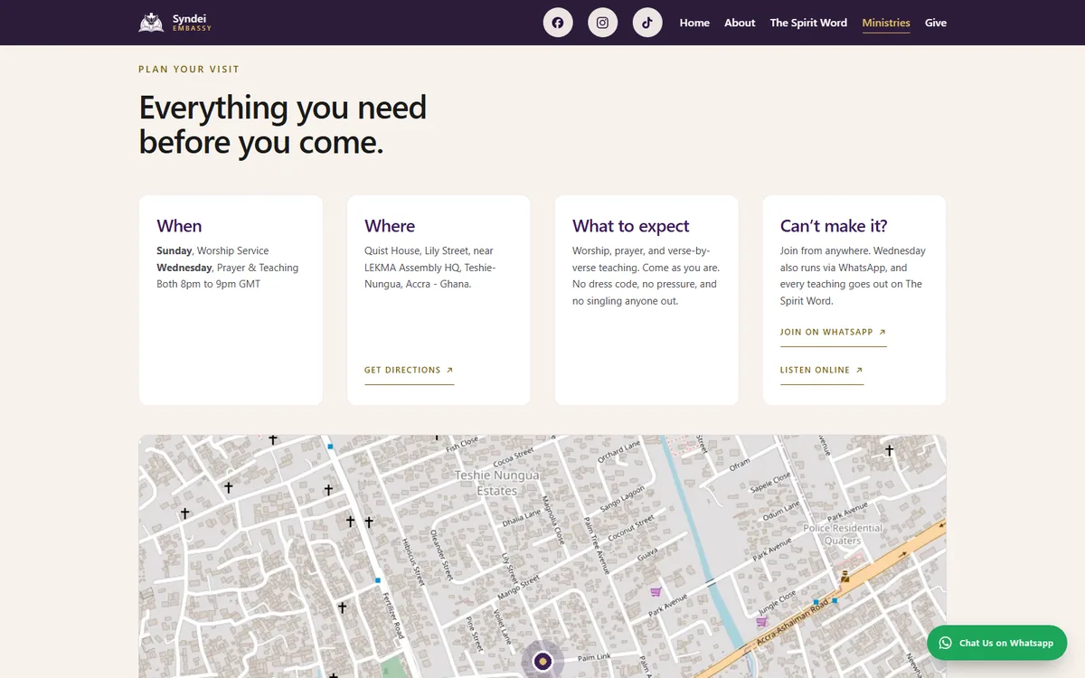
The cost shows up at the moment someone decides to come. A person who hears a teaching and wants to visit needs to know when the service is, where the building is, what will happen when they walk in, and what to do if they cannot travel. None of that could be answered from a social profile. The ministry was reaching people it could not then receive.
Giving had the same problem. Tithes, offerings and a missions fund all needed somewhere to live that was not a direct message.
Strategy and direction
Every section earns its place against one of those two things, or it does not ship. The site is five hand-coded pages. No framework, no CMS, no build step, which means the ministry can hand it to anyone who can read HTML.
The word address is meant literally as well as figuratively. The ministry now writes from its own domain rather than a personal free account, which matters for a registered body asking people to send it money.
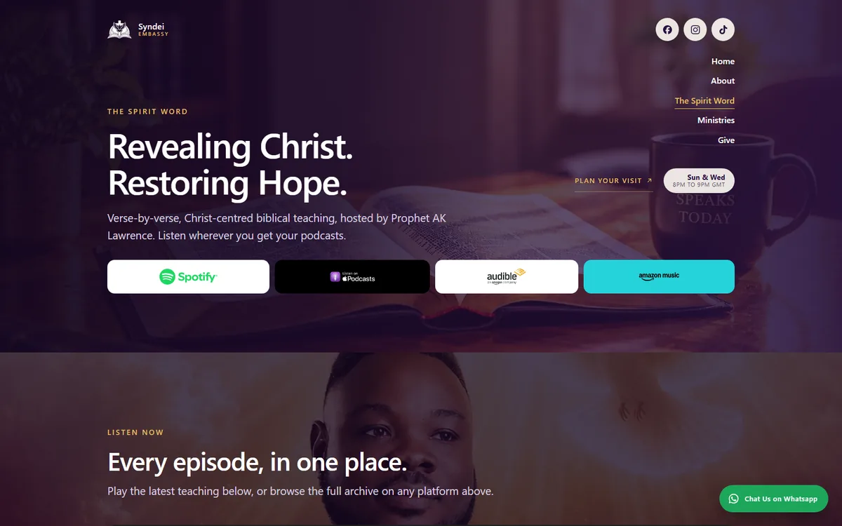
The podcast does work no amount of copy can. The Spirit Word is verse-by-verse teaching that already exists on Spotify, Apple Podcasts, Audible and Amazon Music, so a visitor can hear the church before deciding to attend it. That is a better answer to would I belong here than any description of the culture.
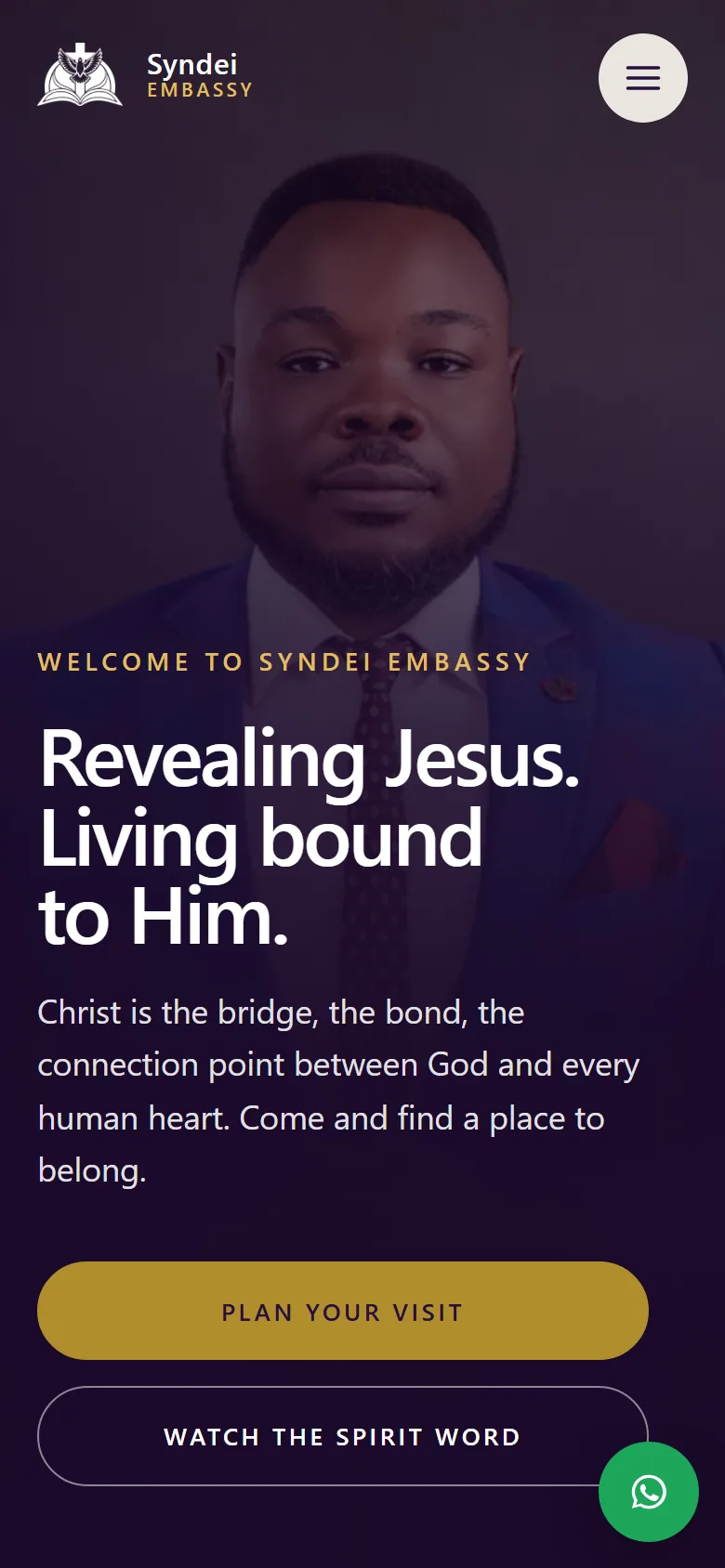
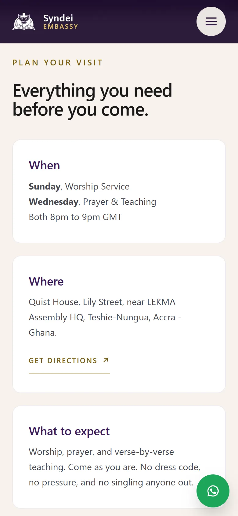
The conventional church homepage leads with a mission statement and buries the service times below the fold. This one inverts that. Service times, address and what to expect come early and plainly. A WhatsApp control stays within thumb reach the whole way down, because in Accra that is the channel people use to ask a question.
The binding idea shapes the structure rather than decorating it. The story runs as a dated timeline from the fast to the Embassy, the Greek word gets its own explanation, and the ministries are framed as ways in rather than programmes to admire.
One build constraint worth stating: every scripture on the site is NKJV and is pulled from a licensed source rather than copied from a verse site. Quoting scripture is a licensing question, not a copy and paste one.
Identity and design system
The logo, the Imperial Purple and the Gold were theirs and were already running across print. The work was turning two brand colours into a system that survives contact with a screen. Brand gold holds on the deepest purple at 5.43 to 1, slips to 4.41 on Imperial Purple itself, and falls to 2.82 on the ivory sections, which fails outright. So the palette carries two inks of the same hue. A lighter gold for dark grounds, 9.50 on deep purple, and a deeper one for light, 5.43 on ivory. The brand colours are never edited, they are resolved per context.
#3B1D5C
#28103D
#B08D2B
#E0BE60
#7A5F12
#F7F2EC
Outfit for display · Instrument Sans for body and controls · Instrument Serif for scripture and pull quotes
The build

Key decisions
Service times get their own place in the hero
"Plan your visit" sits in the hero with the service times beside it. Sunday and Wednesday, 8pm to 9pm GMT. Most church sites bury this in an About page. Putting it in the first screen answers the practical question before the theological one.
WhatsApp sits in thumb reach on every screen
A persistent WhatsApp control sits bottom-right on every screen. For a Ghanaian congregation WhatsApp is where conversation already happens, so the site opens into it instead of a contact form.
Vertical navigation on the right edge
The primary nav runs vertically down the right-hand side rather than across the top. That frees the full width for the display type and the portrait.
Outcome
The ministry can now receive the people it reaches. First-time visitors have found Syndei Embassy through the site. That was the whole gap: reaching someone through a social feed and being findable by them afterwards are two different problems, and only the second one needs an address.
Prayer requests arrive through the site. Someone who hears a teaching and wants prayer no longer has to open a direct message to ask for it.
Giving has been received through the giving details on the site. Tithes, offerings and the missions fund have somewhere to live that is not a conversation thread.
The Spirit Word has gained listeners who came from the site. The teaching was already on four platforms before the build. What it did not have was a page pointing people to it.
Syndei means bound together, and the website has become one more place where people meet the Jesus who does the binding. Prayer requests, new visitors and new listeners are the proof.
Next project
Mavelogx Enterprise
Get in touch
Want work like this?
Tell us what you're building and we'll tell you honestly what it needs.