
Case Study
Mavel's Corner
Publication, podcast infrastructure and brand voice for a faith-lifestyle ministry
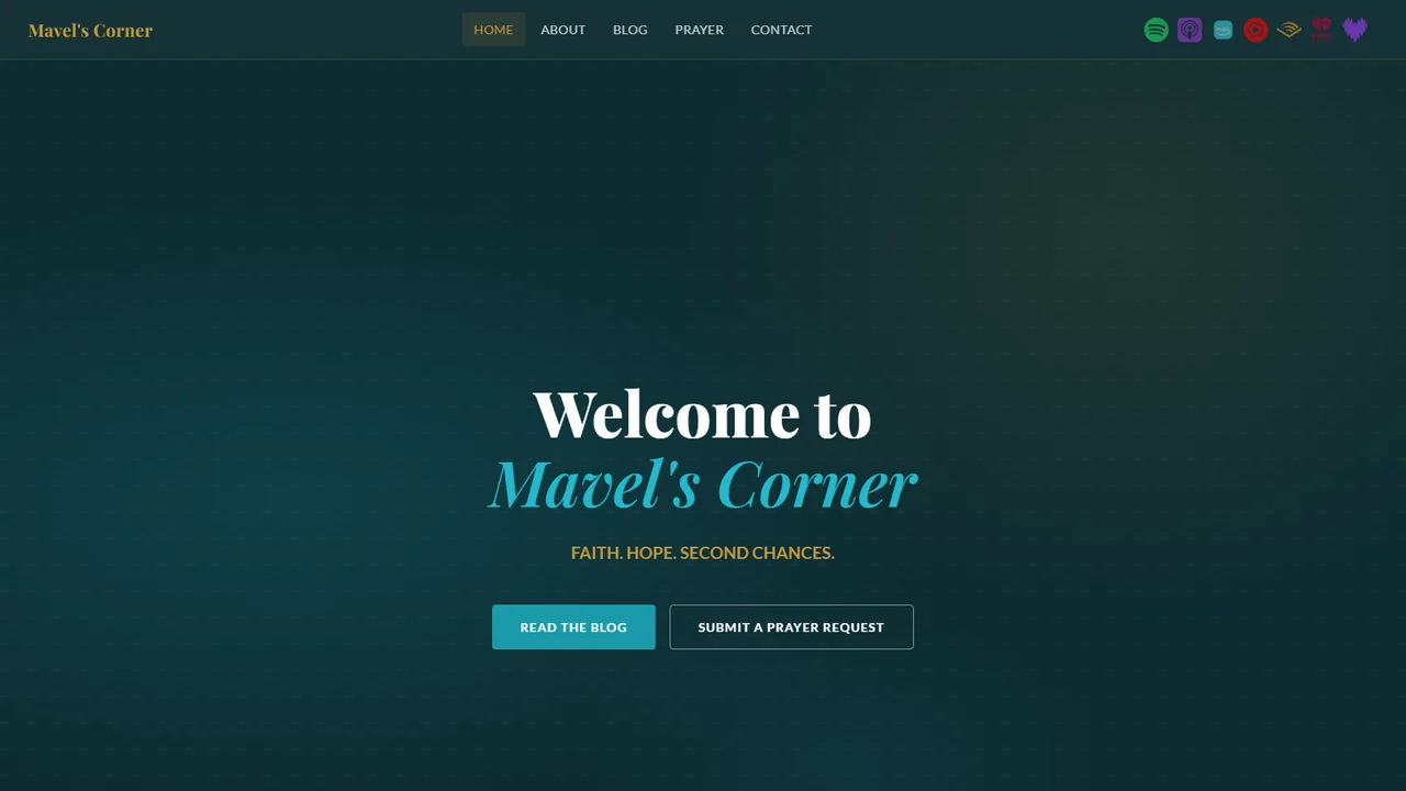
Mavel's Corner is a faith-lifestyle publication. The problem here was editorial before it was visual. The work was a voice that could carry sustained writing without drifting, and a structure that made publishing a routine rather than a decision each time.
The brief
Mavel's Corner is our own ministry brand, which is why it carries the hardest brief we have taken on. In-house there is no client to negotiate the scope down with and nothing to escalate to. You either solve it properly or you do not ship.
The ask was deliberately unreasonable. Give an independent one-person ministry the same reach and the same product quality as a funded one. Three properties rather than one: a publication, a podcast with genuine distribution, and a native app on both stores. Built to a standard we would put a client's name on.
The challenge
Independent ministries fail at digital for predictable reasons, and none of them are talent. Podcasting assumes a studio, a microphone, editing time and a monthly hosting fee. A mobile app assumes a development team, a backend, and running costs that climb with every new reader. Bible text assumes licensing written for organisations with legal departments.
Each of those is a wall. Most ministries meet the first one and stop there.
So the constraint was not treated as something to work around. It became the brief. Every architectural decision started from one question: what does this cost at scale, and can it cost nothing instead?
Strategy and direction
Offline first, not offline as a fallback. Anything that could run on the reader's own device was built to run there, as the primary path rather than a degraded mode when the signal drops. That one decision removed the running costs, the latency and the privacy problem at the same time.
Automate the labour, never the voice. The ministry writes. Everything downstream of the writing happens without a human touching it, and no part of the automation touches the message itself.
Design to the ceiling on purpose. Where a paid service was unavoidable, its free limit was treated as a hard architectural constraint from day one rather than something to discover in production. That shaped the navigation model, the caching and the feature boundaries across the whole Bible module.
What we ruled out matters as much as what we shipped. One major translation was investigated and dropped: its licence excludes commercial use and a direct publisher agreement was not viable at this scale. A build log that lists only wins is a brochure.
Identity and design system
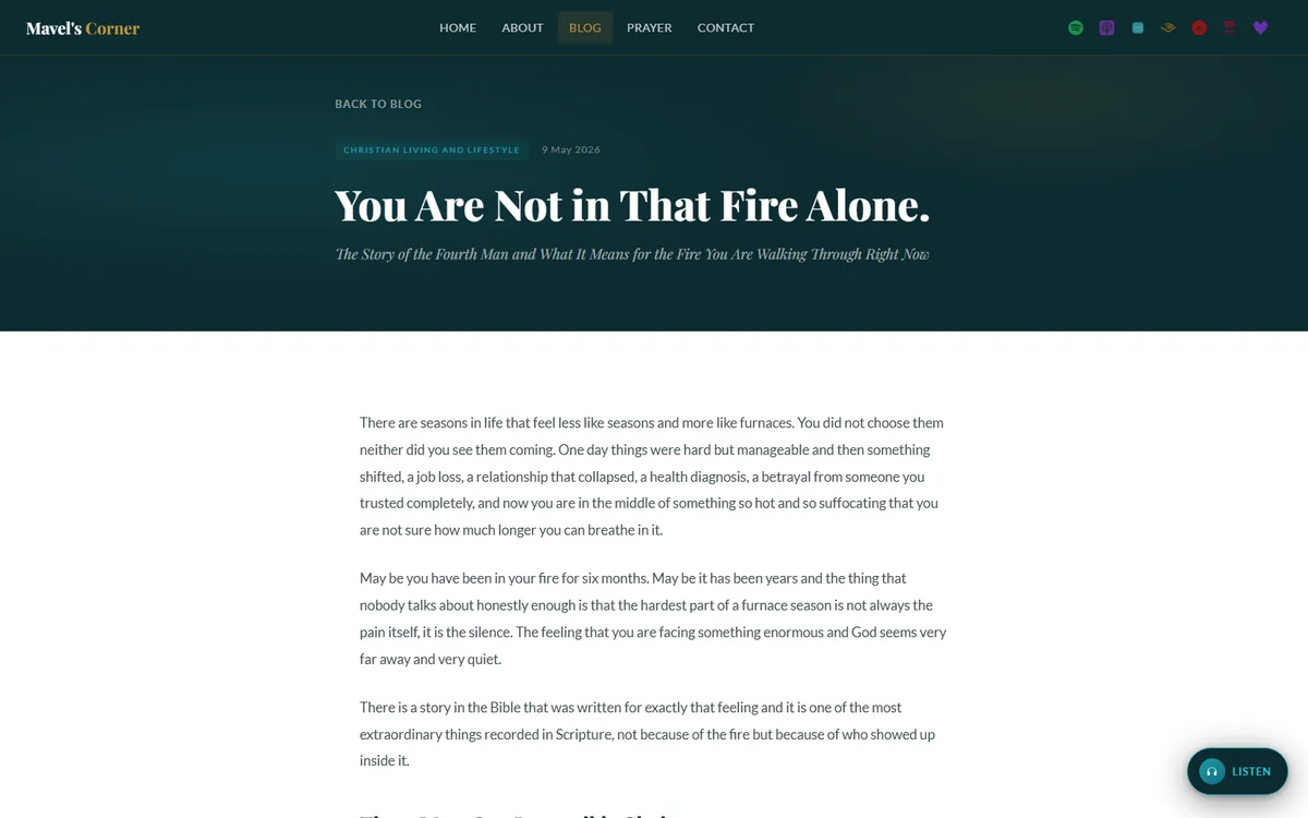
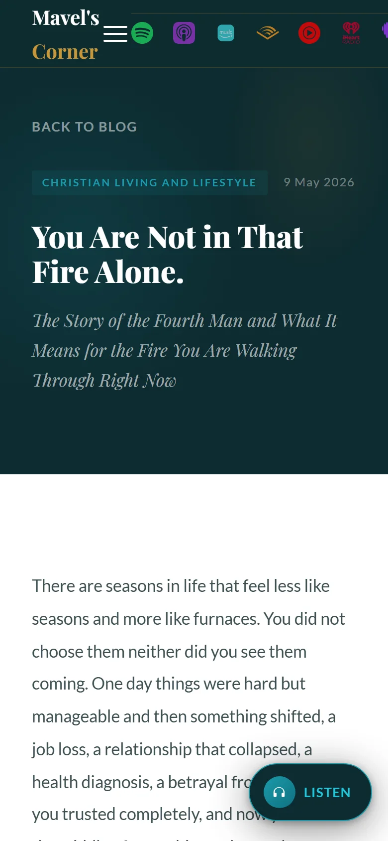
A serif masthead against a sans interface, which signals publication rather than product. The ground alternates between a deep teal and a warm cream so a long read is never set on black. Gold carries the scripture bands and the editorial marks. The cyan is reserved for the two actions that matter, reading and asking for prayer.
#0D2C31
#060F11
#FBF8F2
#C8973A
#1B9AAA
Serif for the masthead, titles and scripture · Sans for navigation, body and controls
The build
Key decisions
Writing becomes a podcast without anyone recording it
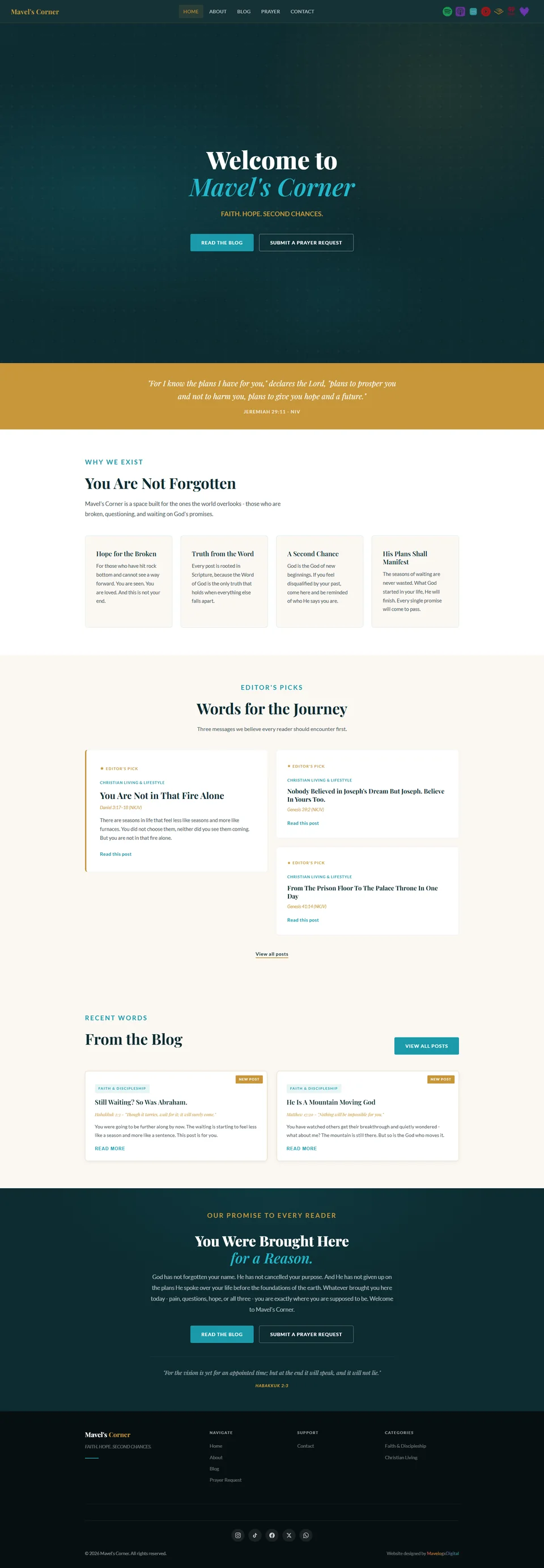
A devotional published on the site becomes a narrated episode and appears across seven listening platforms. No microphone was bought, no studio was booked, and no episode has been edited by hand. For a solo publisher that is the difference between a podcast being a weekly production commitment and a podcast being a byproduct of writing.
The prayer journal never leaves the phone
A prayer journal holds the most sensitive thing a faith app can hold. People write things in it they have told no one. The usual answer is to keep it on a server, encrypt it, and publish a policy explaining the encryption. We kept it on the device instead. There is no server copy to breach and no document asking anyone to take our word for it. That only works because it was decided before the architecture, not bolted on after.
Two Bible translations work with no signal at all
Five translations in total, two of them carried inside the app so they work with no connection whatsoever. Full text search and the random verse run against those two only, so the features a reader uses most can never depend on a network or a quota.
A positioning line that sets the editorial boundary
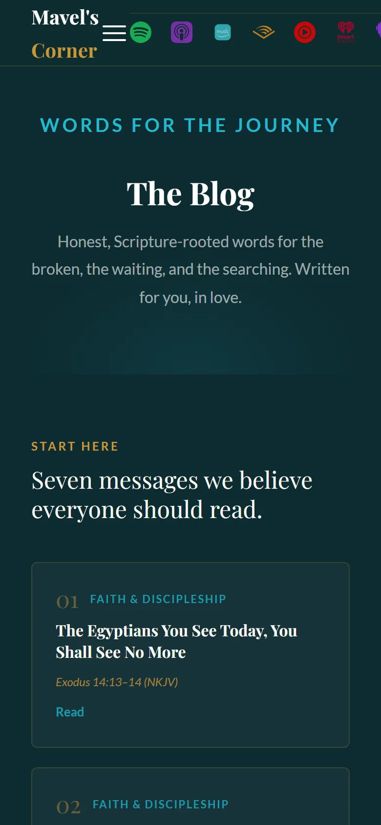
"Faith. Hope. Second Chances." sits directly under the masthead. Three words that tell a reader what the publication is about and, more usefully for the writer, what it is not. That is what keeps a personal blog from becoming a diary.
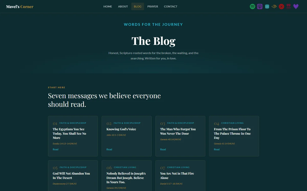
A start-here row instead of reverse chronology
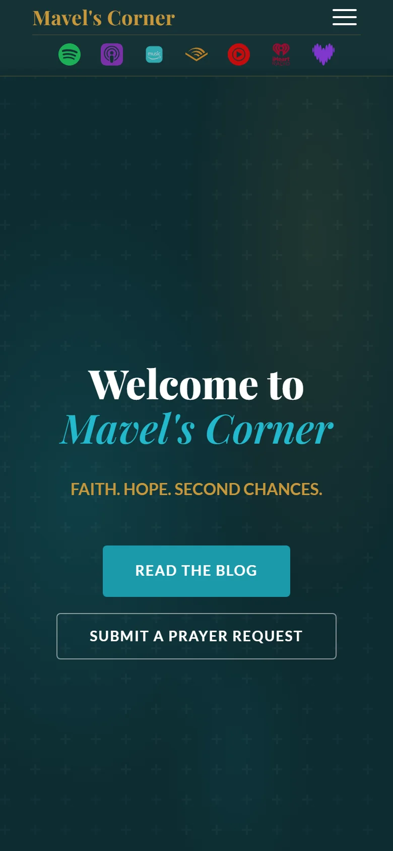
"Read the Blog" and "Submit a Prayer Request" are given equal weight in the hero. One is for a reader, the other for someone arriving in need. Treating them as peers, rather than making the prayer request a footer link, is the editorial decision the design encodes.
A serif masthead against a sans body
The display type is set in a serif while the interface stays sans. That signals publication rather than product, the right register for writing meant to be read slowly.
Outcome
The publication and the podcast are live. Writing goes up on a routine rather than as a decision each time, and every piece reaches seven listening platforms without anyone recording or editing anything.
The app is not launched. Seven of ten build phases are complete, with device testing and store submission still ahead, and one feature waiting on a third party outside our control. We are publishing this while it is still in build because the decisions are the case study. Download numbers, when they come, will be the less interesting part.
Next project
Floks Speaks
Get in touch
Want work like this?
Tell us what you're building and we'll tell you honestly what it needs.